
Description
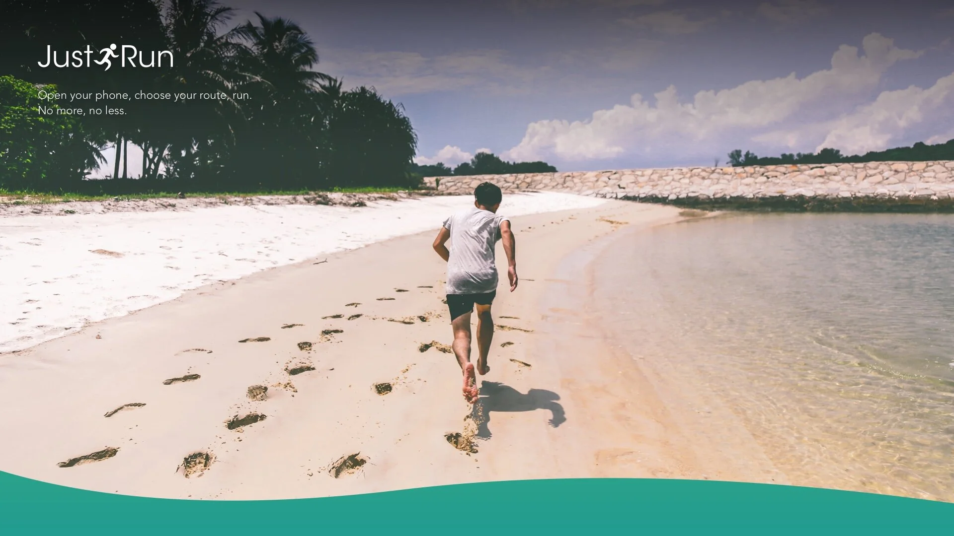
A stripped-down app for casual runners that takes all the friction out of their daily jog; just open your phone, choose your route, run.
Role
lead designer
product strategy
branding design
visual design
user interviews
behaviorial research

Why is it so difficult to find help to just run?
I took up running about five years ago, and I love it. I really do. However, between work and social responsibilities and the unpredictability of life, I found that it’s not that easy to just go run (I prefer running outside to treadmills, so going to the gym is usually not an option).
Even the running apps I used complicated things: I would always have at least three open when I ran. All of them are excellent apps, but they were all missing functionalities I had to access on other apps (5K Runner for its interval training, MapMyRun for its dashboard and map, uRoute to find where to run).
So, I thought, why not make my own app with all those features I wanted in it?
I sat down with an old engineer friend of mine, a fellow runner, and pitched my idea of a running app that did just that: it made it easy to run, no matter where you were, what fitness level you were, or how much time you had to spare. You opened it up, it briefly presented you with 2-3 choices that would facilitate you into running immediately, and you ran. That’s it.
Defining the Goal
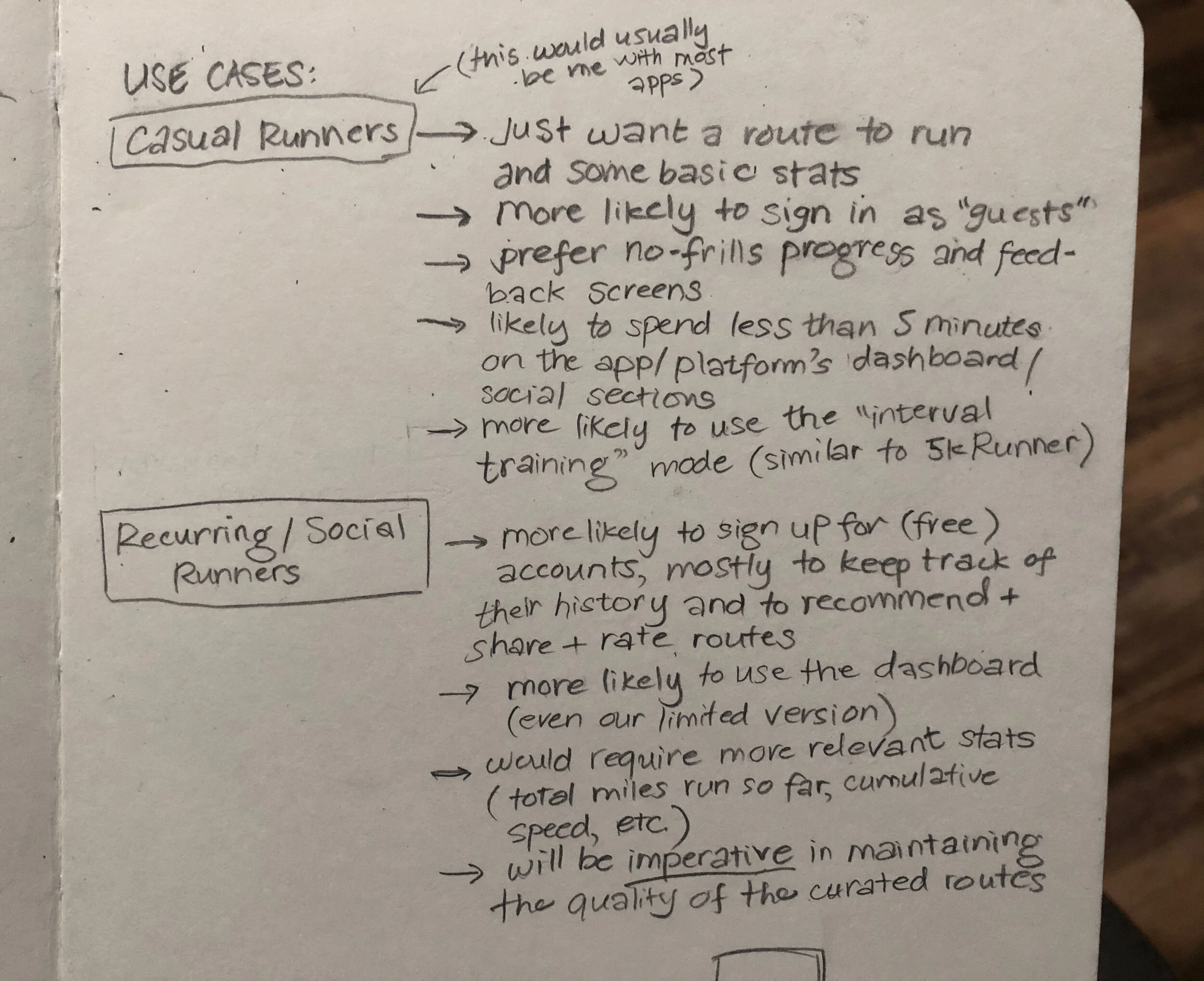
First we drew up the use cases: who would most likely want to use the app out of the hundreds of other running apps out there? We decided it would just be runners, mostly recreational, and they would fall into two groups—the majority would be casual runners, who would most likely log in as “guests” (we decided not to force people to make an account unless they had to), and the advanced/social runners, who would fulfill the crowdsourcing portion of the app by making running routes, rating them, and sharing them.
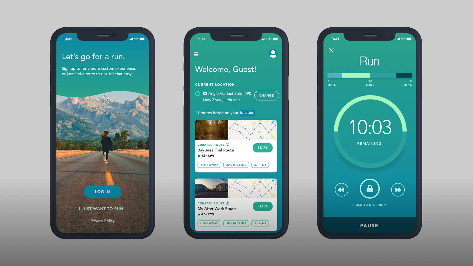
When I began designing, it was with the app mission statement in mind: Open your phone, choose your route, run. No more, no less.


Design Exploration
In high school and college when I used to do web design, I used “style tiles” to help me decide the look and feel of sites I worked on. It’s worked so well that I still do a version of it now as a product/UX designer: I whip up a bunch of high-fidelity creative assets and refine those after a few rounds of feedback from my engineer and test users.
It’s actually pretty surprising how fast we aligned on a big picture goal once we pored over the design exploration pieces.
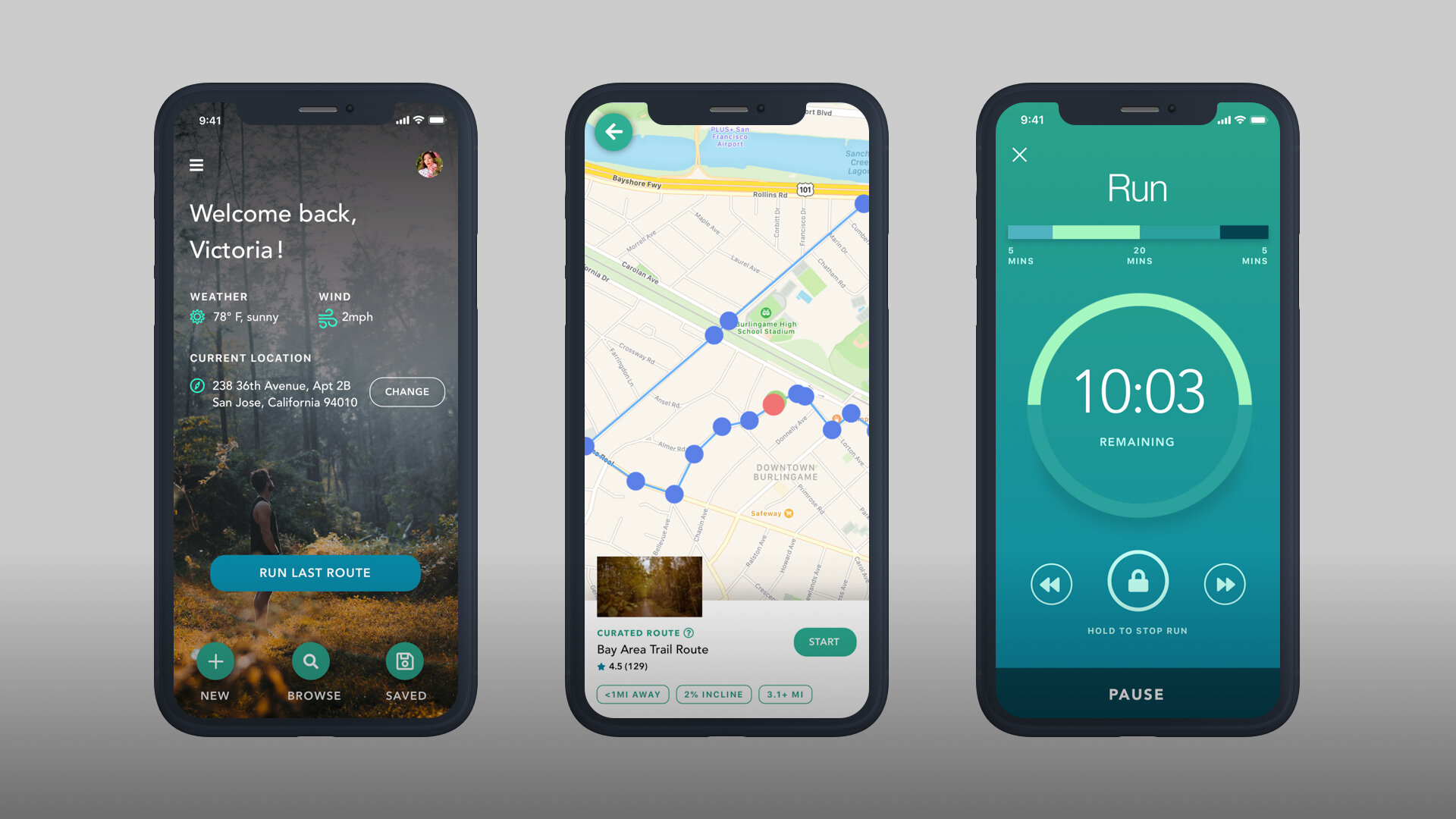
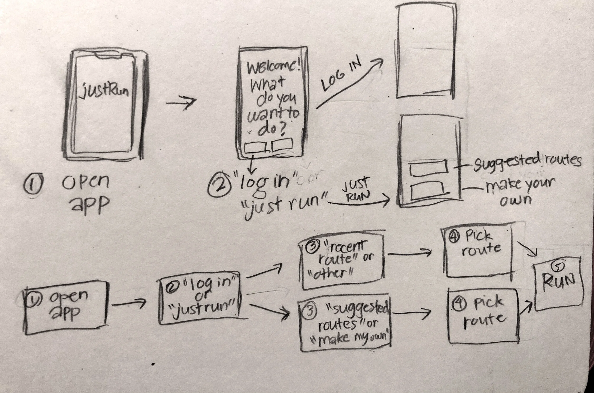
Start Running in 3 Taps or Less!
I wanted to restrict the number of screens—or “taps”—a user needed to get to the running screen, but I also had to think about a) providing them a choice on what they wanted to do, and b) appeasing the two use cases: the unregistered users (guests) and the more seasoned ones.
In the end, I came up with a flow that allowed either user to reach the running screen in three taps (returning users got to skip the login screen and have a “run last route” button on their home screens, and guests got a less customized home screen and a list of suggested routes based on their location). Having more options, such as creating your own route or choosing from a more comprehensive list, would require an additional tap, but it’s ultimately up to the users.
Rule of Thumb
On the home screen, users are presented with three main options up front: run a suggested route, create one of your own, or choose from one of your saved routes. All three options had to be easily accessible with one hand while on the run. As someone with tiny hands in a world where phones are getting bigger, I am acutely aware of this necessity.

The Joy of Iterating
In the beginning, we only had two people available to audit the app design and usability. We eventually included family, friends, and volunteers from our running groups. This phase helped us identify pain points early on, and prioritize certain features over others.
We also recruited testers (mostly from overseas) from the service Usability Hub to further improve the experience. This was really helpful when working with runners in different countries; for example, when testing solely in North America, none of us thought to include metric conversion for users more familiar with the metric system.


Basically Waze, Except for Pedestrians Who Run
As it turns out, what I really needed from a running app was a route to run, details on that route, the option to do walking intervals, and a map to track my progress. So far there was really nothing on the App Store or Google Play that had all three of those functions, and I’ve found that I, like a lot of recreational joggers, are more likely to stick to their running regimen longer if they didn’t need to spend more than 10 minutes trying to find a route to run.
Also, I found that even the most casual runners are happy to share running tips, including their favorite paths. Why not harness that to help make things easier for everyone? Hence the idea of curated routes, which would be ready-made routes either created by recurring users and/or recommended from other map sources. The app would then give you the distance, weather, incline, and estimated time needed to complete the route.
Work on the app was put on hold during the pandemic, and resumed late in 2023 when testers began reaching out to us again with more feedback and some surprising asks on their surveys. These included a more fleshed out dashboard and manual route creation on a Just Run website and requests for a smartwatch version.
Also in progress is a visual rehaul of Just Run’s, including more stylized visuals for a more accessible overall aesthetic, and AI-augmented route creation.